02.
Air Miles
Air Miles
Air miles
02.A
An introduction
02.B
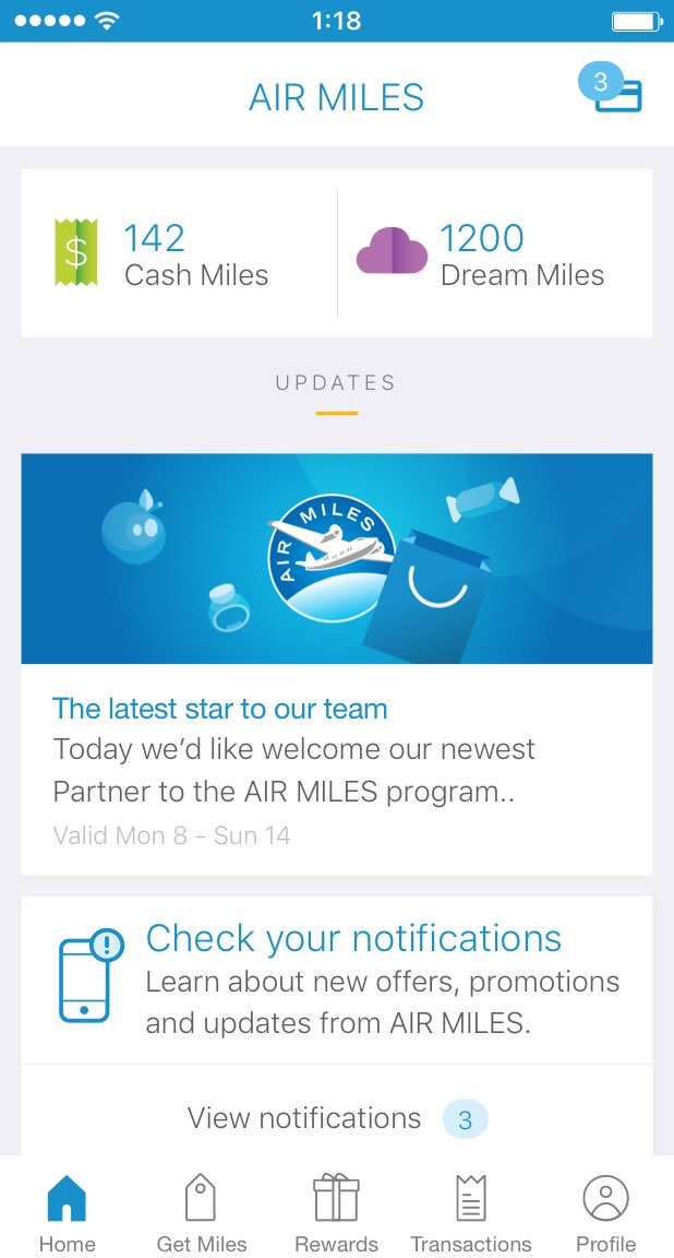
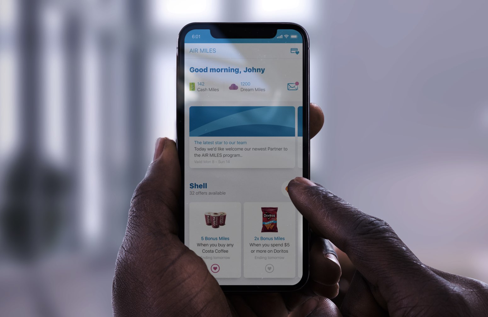
The home feed
02.C
A redesign
02.D
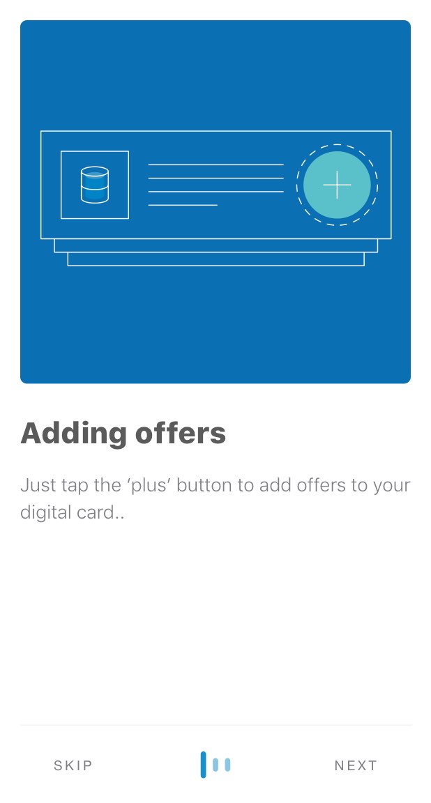
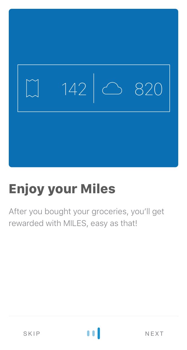
Onboarding

02.E
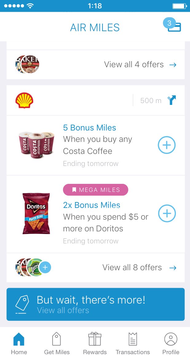
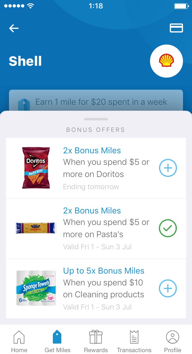
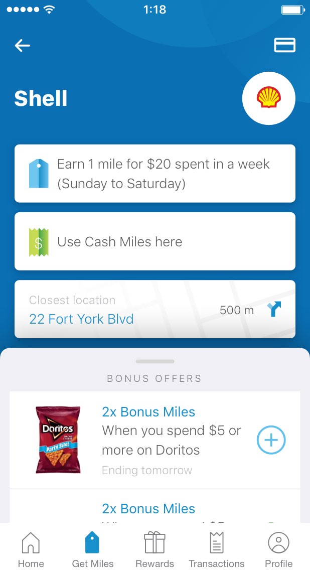
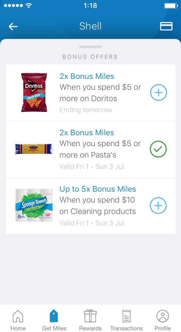
Get miles
02.F
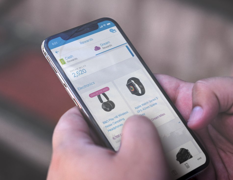
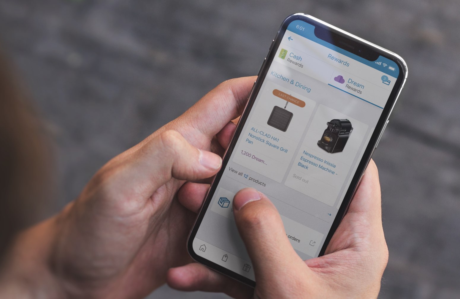
Rewards
02.G
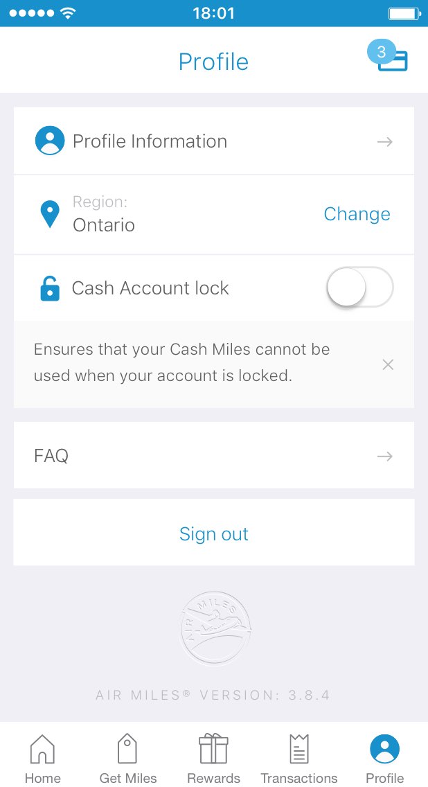
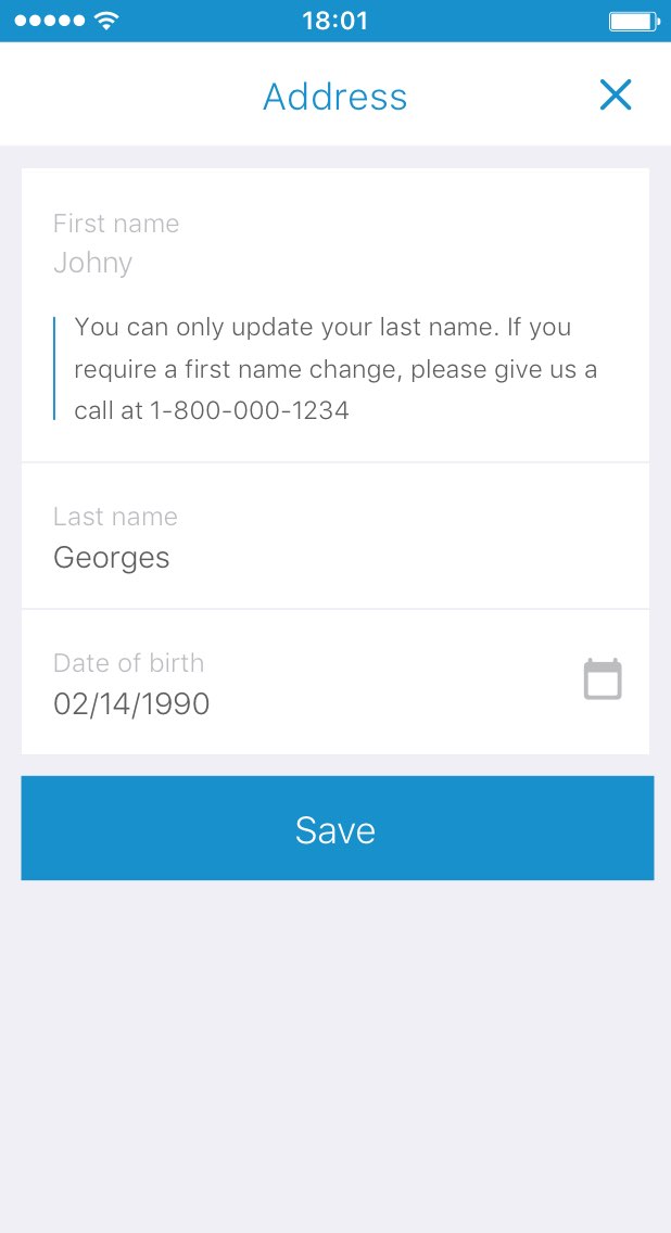
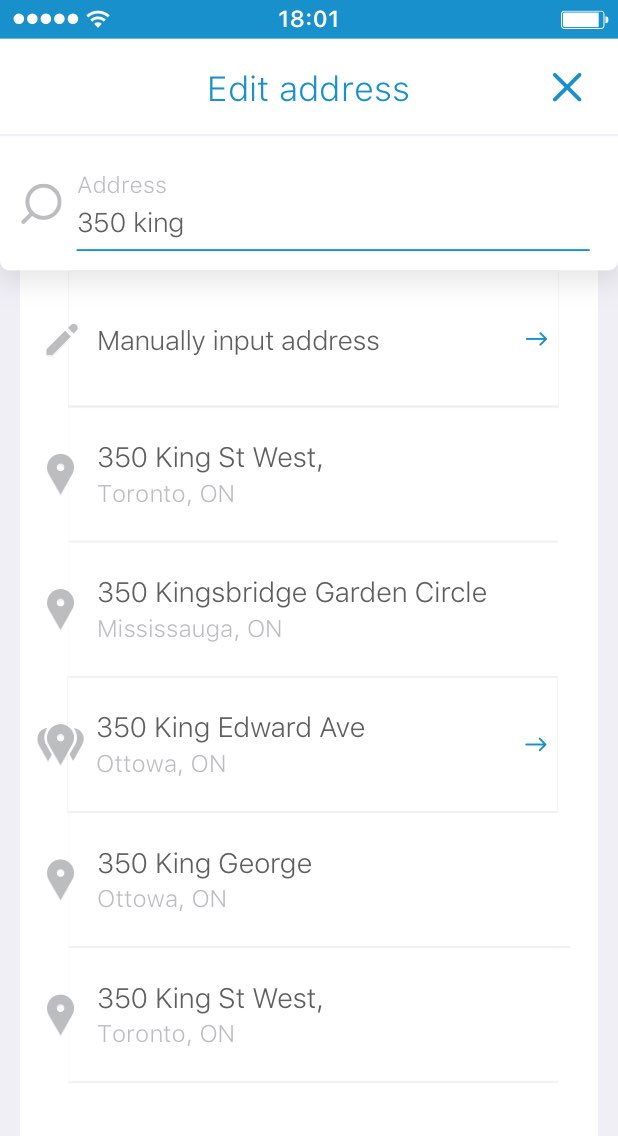
Self Service
02.H